Showing posts with label Forgotten Sea Turtle. Show all posts

Monday, February 10, 2020

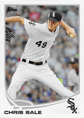
#49 - Chris Sale


What’s that Turtle doin’? Like all horizontal cards, I always get an impression that I am looking at the TV broadcast. Without a doubt, I am influenced in that permanent thought in my brain by the 1955 Bowman design. I should really collect at least a page worth of those cards some day.

On this card it, is even easier than ever to hear the producer out in the mobile truck telling the first base side camera to 'zoom in' just before he cuts back to the traditional shot from center field of the ball crossing the plate a couple seconds after the view on this card.

The illusion of motion is supplied by three things - the crowd blurs in the background, say as the camera follows Sale's arm back as his delivery starts, then the way his necklace does the same as his torso begins moving forward as it begins the drive to the plate off Sale's back foot, and finally you notice the 2 leather end tags of the glove webbing now flying straight up as Sale's right arm begins dropping down in his delivery motion.

And amidst all that, you can still tell that for the whole brief second of time just imagined, Chris Sale's eyes are intensely focused on the point in the strike zone where the ball is about to be delivered, precisely.

I definitely have a love/hate thing going with these zoomed-in torso shot horizontal cards. I quite enjoy horizontal cards, unlike so many uptight baseball card collectors. But I think a horizontal torso is often inferior to a horizontal card that lets you see some game action, and hopefully some of the other sights of Major League Baseball than just a player from the belt up and nothing else. But then on the other hand - when these Pitcher torso cards work, they work, and this one works pretty well, for me, and would possibly make it to a 'Favorite 9' binder page for this set if I were to assemble one. It would definitely make it to such a page of just my favorite horizontal cards.

Another obvious feature of this card is Chris Sale's unique frame, which often makes his cards quick to stand out amidst checklist-mates. It wouldn't surprise me if, somewhere in a visual dictionary of some sort, there is a picture of Chris Sale used to illustrate the word 'lanky.'

The other big 'get' in this image is the special red piping on the White Sox uniform here, and the red hat, and the red belt. This seems kind of odd in that one wouldn't expect the White Sox to want to remind people of the other Sox team in another city altogether. But baseball card collectors probably know better than most that a team with one of the more sartorially simple team names has had one of the longer histories of uniform changes.

These red pinstripe uniforms were a Chicago home uni from 1971-1975. Images of them do exist on 70s cards, however you are probably more able to remember their powder blue road uniform from that era, as Topps was so much more likely to shoot a photo of a baseball player in New York City than any other location.

In 2012, the Sox brought the look back for a special "Home Alternate" uniform they only re-used for that one season, before moving on to mining their many other historical uniforms. This 2012 uni will appear in a few more cards in the set; this one is particularly ironic given Chris Sale's famous disdain for 'throwback' uniforms that surfaced a few years later.

Uniform Hero? Once again, the card # appears nearly dead center on the front of the card.

Where’d the egg hatch? The White Sox drafted Sale in the first round in 2010 as the 13th selection. A pretty canny #1 pick by the Sox, given that the 12 teams in front of them batted only about .333 with their picks.

How about the migrations? There has been just one, a famous / 'blockbuster' trade after the 2016 season, when Sale still had 3 more years of club control, a far more serious affair than trading a 1/3 or 1 season 'rental'. The White Sox received Michael Kopech and Yoan Moncada and 2 more prospects back in return; the story of those 2 players has yet to be fully written although as the 2020s dawn as I write this entry, Kopech and especially Moncada could prove to be key pieces on some likely ChiSox playoff teams in the decade to come. 

As for the BoSox, they won the World Series in 2018 and re-signed Sale for the 2020-2024 seasons. I would say the trade was a great success for both parties, and it is not inconceivable to imagine Sale facing Moncada in a key play-off At Bat in the near future.

Don’t flip over real Turtles.

I like the key detail here explaining Sale's initial career arc, which Tigers fans at the time understood all too well. His experience in the bullpen would certainly serve Boston well in 2018. Though I must confess this is the first I have ever heard of Dave Lemonds, who probably has a baseball (& baseball card) story to tell, but for some other blogger to discover.

Can the Turtle Catch the Rabbit?

CAREER CHASE: With 303 strikeouts, Sale is 5,411 away from Nolan Ryan's all-time record of 5,714.

Being 5,411 Ks away from the All-Time leader certainly seems like an impossible comparison, but for an obviously excellent young Pitcher given this choice checklist spot coming off a season of almost 200 Ks, this comp does make sense.

Sale would go on to start earning some red ink in his card back stats, including an MLB leading 308 Ks in 2017. After the 2019 season and ten seasons of play, Chris Sale has the impressive total of 2,007 strikeouts.

Subspecies? As with most players this low on this unique checklist but high on the MLB totem pole, this card does appear in both Chrome and Opening Day, but without any other variations in any of the 3 pack issued sets, outside of a nicely stamped version in the "AL Stars" 'factory' blister pack of cards assembled by Topps for retail sale, usually in June of each year.

Those retail blister products do supply an interesting Sea Turtle variant, however:
I do not know why Topps chose to create another card for Chris Sale here; this is the only unique card from the White Sox "Team Set." On that particular card, Sale's delivery is captured quite near to the same point as depicted on his regular card, with some of the same motion indicators such as the necklace now being pulled forward. Though Sale always looks interesting on his baseball cards, the odd frame slicing of his hand and then glove re-appearing on the card makes me favor the regular horizontal card much more. This card does give a better view of two left shoulder patches the Sox wore in 2012, but I think we will be able to see those better on an upcoming card.

There are a few other teams that have a unique card for a key star in those Team Sets and those share a key similarity - the pack issued card is a horizontal card, as in this case, and the differing card in the Team Set becomes a vertical card. At first I suspected there may have been a production advantage in not using any horizontal cards for the product, but then I began discovering plenty of horizontal cards still included in the small, generally 17 card sets. My new theory is that for a player selected to be the 'cover' card fronting the stack of cards inside the blister, it looks much better to have a vertical card; and each team has a key player that is the obvious best player that should be the 'cover' player. Other unique Team Set cards are connected to players changing teams during the creation of S1, S2, and Update, and a few Forgotten Sea Turtles were just otherwise forgotten by Topps outside of the Team Sets, something true of one other class of Forgotten Sea Turtle that I won't be posting for a long time to come.

I have been holding off on posting any cards from these  retail blisters, in hopes of finishing off my collection of all 30 teams. And as it turns out, I already skipped over one such 'Forgotten Sea Turtle' card, as I will be labeling them in posts to come. A lot of those cards will actually appear in connection with pack issued cards in Update; on this blog, that will be many years from now. But I have gone back and added one such card, to the #5 - Carlos Gonzalez entry.

Alas, I probably took too long to try and pick up all of the sets and it has now become impossible to find the last few teams I need: Atlanta, Baltimore, Boston, New York Mets, Pittsburgh, and Cleveland. Most of the sets do have a card I want - a "Stadium" card. Those were a remarkable entry on the 2019 Topps Baseball checklist, but were not a completely new idea. The Sea Turtle design serves them well.

I will be adding the Stadium cards to various individual card posts as I move along, generally when a unique "Team Set" card has to be added to an individual card post. There is a 'U.S. Cellular Field' card for the White Sox which could be appended here, but for what should be obvious reasons, I have added it to the #12 - A.J. Pierzynski post.

At this point however, obtaining my own copy of the last 6 team sets I need looks like it will be very difficult. I do want the Stadium cards, and any card in them that is unique to the Team Sets. But even more than that, I need checklist information from them, such as whether a Stadium card even exists (not all 30 of them were made by Topps), and whether any unique card is included on the short checklist (same, in that not all teams have a card different than the pack issued cards). 

If you have any of those 6 'Factory' Team Sets from 2013, please get in touch.

Bling That Shell You should have been able to already guess which parallel I selected here for the All Parallel set:


Similarly to the Rizzo card, this relatively low leverage 'retail' parallel is one of my favorites of all the 2013 cards.

This card is also a perfect place to illustrate a key construction detail on the Sea Turtle cards. For a long time, I didn't understand why I was so drawn to the White Sox parallels in particular. I also often wondered how the 2013 cards would be handled by the 'TPGs' - Third Party Graders. I have zero wish to own any graded cards for my collection, but as I read baseball card hobby commentary on the Internet, I know well how important grading is to others. Overall, I basically feel sorry for people who can't enjoy a card unless it has been declared 'perfect' by someone else.

And of all the possible imperfections that can ruin a chance at perfection, there was one I figured to exist on almost every Sea Turtle card I have ever purchased, _except_ most of the White Sox parallels. That possible imperfection, I thought, was the print registration of the image, and more specifically the boundary between the photo content and the design content.

Here is an example from the same regular white base card scan of the Ryan Cook card in the previous post to this one:


The construction technique is now obvious - rather than have the image snug up to the color portion of the design, whatever color that may be, the graphic design is actually bounded by a thin grey line. However until this is seen in close detail, many a 2013 card looks like the the image and the design edge are just not getting along correctly, leaving a bit of white space rather than a clean connection from imagery to design element.

Here is the same area from the Sale card:
Since the White Sox have a grey team color, there is no additional grey line between image and colorful design element; instead there is a single grey line, thicker than any of the image boundary lines for the other colors in the set.

This gives the White Sox cards, for the most part, an extra crispness to this portion of the card. Although ironically, any teeny tiny flaw in the printing process, leaving a bit of white between the image edge and the design edge, is most easily seen on a White Sox card. Which thus illustrates the reason to use a tiny grey boundary for the image rather than letting the image adjoin the color striping —any white space created during printing would be far more noticeable between colors of the image and the bright color of all non-White Sox designs.

And what I finally realized is that for the White Sox parallels, that increased purity of just the grey striping to the design makes them 'pop' that much more effectively on their parallels. Not so much of that can be seen in a clipping of that same area, from the red parallel:
though there is a touch less white created at the edge of the photography. That would actually vary completely from individual card to individual card, and I don't mean card #49 vs card #48 - ten copies of either card might have ever so slight differences in all this, created during production, not design.

There are many more White Sox cards to come in this project, and many of them are beautiful, crisp parallels. So as with the #12 - A.J. Pierzynski card, I am collecting a full 'rainbow' effort of this card. I would almost like to collect a full White Sox team set in the following parallel (as I started to attempt with one other team, before deciding to collect the whole set in parallel, sort of). So I will leave you with one bonus parallel for this favorite Sea Turtle:


Tuesday, January 22, 2019

#12 - A.J. Pierzynski

What’s that Turtle doin’? Here we have one of my favorite cards in the entire set. If I can someday get around to a Base Set's Top 40 Baseball Card Countdown just for the 2013 set say by the year 2029 or so, this card will finish very high indeed.

Even though there is very little mystery or action to discern here. Pierzynski is simply posing for a photographer, probably in what appears to be a voluminous part of what was then called U.S. Cellular Field and is now called Guaranteed Rate Field. I would think he is standing closer to the short wall at the edge of the field than he is to the actual on-deck circle.

And this is a classic baseball card image, with a lineage going back through decades of baseball cards. I would expect that anyone reading this blog is familiar with such. If not, please go out and purchase a random lot of 500 mixed beat-up 60s - 80s Topps commons and start over with the Sea Turtles later on.

But I can hear the complaints coming in through my computer screen already - "I hate all that advertising." "I hate corporate ball-park names!"  I'm with you on that 2nd one; only as pitiful a name as 'Guaranteed Rate' could make you miss saying something like 'out at the ole Cellular today...'

Advertising has been part of baseball pretty much from the beginning, or at least the beginnings of the players being paid. Money to support the whole thing has to come from somewhere, and even 19th century club owners would not turn down a revenue stream just for the sake of some non-commercial purity ethos.

And of course, the very first baseball cards were actually tiny advertisements.

But the ads were largely kept off of the fronts of the cards for a very long time. The first one I could find on a card, admittedly without an exhaustive search, was a 1950 Bowman issue, here cribbed from my collecting projects partner COMC:


I think because of a card from the year 2013, I will some day purchase my first card from the year 1950.
Now to be sure, ads you can't quite connect to a specific actual advertiser aren't quite the same as the 6 easily recognizable ads on the Pierzynski card. And as long as cards were created by hand-made artwork, like this one was, the ads on outfield fences and billboards were usually simply not re-created, even when they were possibly part of source photographs used to create the artwork.

This remained true as baseball cards transitioned to be the simpler-to-create printings of the actual photos. Some of my own base hunches about all this are that photographers shooting photos at major league ball games across all decades were a) cognizant of the fact that an ad in the background of a photo distracts from a subject in the foreground, and were b) largely working for newspapers, who wished to sell advertising, not give it away free in their photographs. Printing an image of a baseball player in front of the Burma Shave billboard in the outfield on the cover of the sports section is not going to be appreciated by the Barbasol executive who just purchased a few weeks of print ads in that same sports section, though maybe the Burma Shave exec would buy you an extra martini at lunch the next day.

To consider the implications of advertising & MLB for this post, I spent a little time wandering the web on the topic. I did not find a just-exactly-perfect, detailed history of the interaction of professional baseball and advertising to share a link with you - perhaps someone out there should write one. But I did pick up a few tidbits along the way this morning, including one about the famous "Green Monster" in Left Field at Fenway. I bet few fans today realize that it only became "Green" in 1947 as previously, it was covered in advertising.

I suspect that as the 50s and 60s and then 70s and even large portions of the 80s moved along, Major League Baseball probably was at a lower point in having tight connections between seeing live baseball action while simultaneously seeing advertising in the same visual frame, as compared to earlier decades, and the way 'the game' looks today, as seen on this A.J. Pierzynski card, and many, many other recent cards. At some point, ownerships once again became quite willing to bring in revenue by returning to selling ads on every surface a fan might gaze upon.

So I think by first becoming familiar with cards always free of ads in previous decades, this then creates a feeling of negativity around cards like this one. "I just want them to be like they were when I was a kid" is an incredibly common sentiment among older collectors today. Now, you kids get off my lawn, too!

Lately I have noticed a new access to historical images of the connection between pro baseball and advertising - on baseball cards, like this one:

Of note regarding this card from the 2011 Topps Lineage set, it is card #42, and not the only card # & Uni # match on the checklist, some 2 years before the 2013 Sea Turtles.

As Topps and Panini continue to mine old photos to use on new baseball cards, a little more of the historical amount of advertising around the game is now seen, on some cards. I haven't found a lot of them over the past decade, but they are here and there, and they do catch your eye with their contrast to original cards of the same Star players from 50+ years ago.

Thus this #12 A.J. Pierzynski 2013 Topps baseball card connects me to major league history in a certain way. It also connects me to baseball card history, as sets of baseball cards used to routinely use photos shot from the sidelines of baseball activity of all types. Naturally, given the location of Topps, Inc., a lot of such images came from Yankee and Shea Stadiums when this practice began. The modern composition of _the_ Topps Baseball set every year is to use action shots, action shots, action shots, as we will see routinely in this blog, but that is in no way an historical Topps approach. I'm not sure just when the set became > 95% live action, but that is the way it is today.

When the first true photographs of live action on cards began appearing (as opposed to the illustrated-from-photos technique occasionally used earlier, as in 1956 for example) in the 1971 set (none in 1970? correct if I am wrong), they were a welcome relief from sets composed of >95% posed pictures. And then for a long time sets were a mix of action, and semi-action or 'candid' photos snapped along sidelines or dug-outs or a spring training field, and actual straight poses for the camera shot in those same locations, often times from the official "Photo Day" teams have (and still do today, in about 3 weeks as I type) at the very beginning of Spring Training. 

Current decade sets have abandoned that approach entirely, at least in the 660 or 700 card Topps Baseball set. Recent Heritage releases have used cards almost exclusively sourced at Photo Day, but then recent Heritage years have been reproducing a difficult period for Topps, the late 60s, when photo rights contracts with the players were in a great deal of flux and assembling the images for the sets was probably the most challenging in the whole history of Topps. So Heritage sets of the last few years really shouldn't be judged much, on this question. The imminent release of the 1970 style Heritage set will be fascinating in this regard - will "the Stadium" once again appear as a back-drop on the baseball cards? One bright spot on this question has been found in recent releases of the Archives set, where the tradition of mixing up the photo sources has begun to ramp up somewhat, after initial Archives sets were heavily composed of generally tepid Photo Day images.

Meanwhile in the most recent Topps Baseball sets, only a similar handful of cards are drawn from 'candid' sources in a set using >95% live game images, though perhaps with a few more cards than we will see in the 2013 set. These days, 'candids' are largely reserved for use as Photo Variations, which most casual collectors will never own beyond an occasional example pulled from a pack.

When I first beheld this A.J. Pierzynski card, it gave me hope that the set was going to become more 'mixed' in terms of photo type diversity, a hope that did not come true. But whenever I see this card, that hope is renewed, as with baseball cards, the old expression re: baseball is also quite true: "there's always next year."

Whew. That leaves just one more mystery about the card at hand - what game is it from? I have tried several times to figure that out; only a high quality scan of the card finally cracked the case for me. There is a very similar image of A.J. from September 2011 in the Getty archives, however it clearly shows Paul Konerko in the batter's box. On this card, Alex Rios is batting in front of Pierzynski, in the bottom of the 1st, with a runner on 3rd and 2 Outs. It is a nice sunny day game, with full stands - probably a weekend game. The visiting team has their road greys on, but they have blue caps and other bits of blue on.

As it turns out, the Blue Jays visited Chicago on Saturday, July 7, 2012. In the At Bat underway on this card, Rios grounded out, ending the inning.

Uniform Hero? As seen on A.J.'s right breast - and the bat knob.

Where’d the egg hatch? A.J. Pierzynski was drafted in the 3rd round by the Twins in 1994, for whom he essentially had 3 "Cups of Coffee" type appearances in MLB from 98 through 2000, before becoming a starter at Catcher for them in 2001.

How about the migrations? His stint in Minnesota would include 2 more full seasons before a trade to the Giants for the 2004 season and then moving to the White Sox in 2005. As this card was coming out of packs, he was coming off his best ever season at the plate for Chicago, posting an .827 OPS. However his contract expired after the 2012 season and Pierzynski had already (December, 2012) signed with the Texas Rangers for the 2013 season. So this became his final White Sox baseball card. He would go on to also play in St. Louis and Boston before retiring after 2 seasons with Atlanta in 2015 and 2016 - his 19th.

Pierzynski was definitely not a "beloved" player by many, for transgressions I am not always familiar with, including one famous on-field brawl. Despite that, he began a broadcasting career while still an active player in 2011, by working on post-season broadcasts. He is currently a full-time baseball analyst for the Fox network.

My own most cognizant memory of A.J. Pierzynski is an oddball stat that I have never put much time into tracking down. After his many years in the AL Central, he was quite familiar to broadcasters in the division. The radio crew for the Detroit Tigers, who supply me with a large portion of my baseball news every season, would always comment on one of his hitting tendencies - he would normally be found atop the current  'leader boards', wherever those are kept, for one specific stat: his tendency to swing at the first pitch of an At Bat. I do hope to see some actual #s on that, somewhere, some day.

Don’t flip over real Turtles.


No fuss no muss, just a nice compendium of his career stats to date.

Can the Turtle Catch the Rabbit?

CAREER CHASE: With 1,645 hits, Pierzynski is 2,611 away from the all-time record of 4,256.

On their 4th try with this one, Topps did get the math right, for only the 2nd time.

Pierzynski finished his career with 2,043 Hits, becoming just the 9th (10th if you count Joe Torre, who played more games in the infield than behind the plate) Catcher to break the 2,000 Hit mark. Unlike Yadier Molina, I do not expect he will receive many Hall of Fame votes, though his career was very impressive nonetheless.

Subspecies? After changing teams probably during the production of this card, Pierzynski does have some other Sea Turtle design cards, though he is the first player on the Series 1 checklist to not appear on the 220 card Opening Day checklist. He appears with the Texas Rangers in the Update set, as he does in Chrome and on one other card. When I reach his Update card, many years from now, I will examine the other Pierzynski Sea Turtles.

2019 Update: As I detail in the #49 - Chris Sale entry, I have now begun adding unique cards from the Topps 'factory' "Team Set" issued in blister packs in June of each year. As I wish to keep the one card, one post format for the blog, I will be adding the various unique cards to the most apropos pack issued card as I go along. This is clearly the right post to add this card:

& the straight-forward card back:


Bling That Shell Another easy decision to select this one, although another that also took a few years to track down. The White Sox have a singular Sea Turtle 'team color' - grey - that looks excellent on most every parallel, though of all the teams, their cards do struggle the most on the /99 Camo version. But along with one other easily guessed team, their cards look absolutely exactly perfect on the /62 Black versions:

However, I like this card so much that I decided to collect a partial 'Rainbow' of the possibilities. My first shipment home from COMC includes our first view of the /230 'Factory Set Orange' parallel, for a page I have made good progress on, with just 2 easy spots and one difficult one to go:


Saturday, January 19, 2019

#5 - Carlos Gonzalez

What’s that Turtle doin’? For our second horizontal card, we get our second Base-Running card, and our first Sliding card. Gonzalez is so perfectly framed by the design elements that it appears the baseball diamond / turtle-back is the Home Plate he is aiming for.

Showing a player's complete body, from head-gear to toes, inevitably comes at a slight cost in facial recognition. But that is perfectly fine on this card, which includes nice, digital-photo-era captures of split-second action with the flying dirt, as well as a velcro strap on one of Carlos' batting gloves still streaming behind him as he slides.

He appears to be Safe at first glance. But the Catcher's glove either already holds the ball and is just waiting here to tag Gonzalez' foot Out on the left side of the card, or has not yet been raised to catch the ball on a throw in from the field. Could go either way.

Given Carlos' 3 year membership in baseball's "20-20" club (HR, SB) at this point in his career, using this image of "CarGo," a player known for speed on the basepaths, is a great choice.

Uniform Hero? A clear member of the club, seen right on-card.

Where’d the egg hatch? Hailing from a town that regularly produces Major Leaguers - Maracaibo, Venezuela, Gonzalez was never drafted. He was originally signed by the Arizona Diamondbacks.

How about the migrations? Like seeming every prospect playing in the western half of the United States, Carlos ended up in a trade with Oakland's Billy Beane, where he debuted in 2008 for half of the season. And like so many Oakland prospects, he was traded once again, that time to Colorado, where he has played ever since. The return player was Matt Holliday, who would end up back in Colorado some ten or so years later; this trade feels like a good even-up for 2 similarly good players.

In 2018, Gonzalez signed with the Rockies once again, on only a one year deal, which worked out well in Colorado, until a decided fall-off in September as the Rockies vied for the division crown. Writing in early 2019, Carlos is still 'on the board', unsigned as I go to press here, and has generated little buzz in MLB Free Agent coverage this off-season. There is a similar lack of news on his own thoughts on trying for another Go in the Major Leagues.

Don’t flip over real Turtles.
On this card back we learn a more intimate, family nickname. We also see a League Lead in Hits and Average, something rarely a surprise for a good hitter playing in Colorado.

Can the Turtle Catch the Rabbit?

CAREER CHASE: With 648 hits, Gonzalez is 4,028 away from the all-time record of 3,608. 

Challenges continue down in the Topps baseball card mines, where we now wonder who has 4,676 Hits, or 3,608 Hits, for that matter. Maybe Charlie Hustle got wind of this effort at Topps, and was able to place a curse on it.

Gonzalez sits at 1,403 Hits after the 2018 season.

Subspecies? Another identical card in Opening Day & Chrome, with no SP variations that I know of, though with one more difficult-to-discern possibility, out there. Naturally, whenever new-to-me Sea Turtles are discovered, you will be notified, eventually.

2019 Update: I have now tracked down that difficult possibility:
This card was issued in the "Team Set" 'retail blister' product Topps issues for each team around June of each year. I have now begun adding the unique cards sometimes found in those, via adding them to the post for their pack issued cousin. More details can be found on the #49 - Chris Sale entry.

I do like this card as well as any other Sea Turtle; I particularly like the way the purple batting gloves complement the card design and finally help you notice the purple batting helmet as well. It does look like Carlos' eyes are following a grounder, rather than a swinging strike, but it is hard to tell.

The back of this card is the same as the pack issued card back seen above, outside of the card #, which is COL-1. This is now only the 2nd Rockies card I have scanned for this blog, but is the first where I have noticed a key detail on their cards - the color of the CR team logo is _not_ purple! 

After all these years of playing with these cards, I am amazed to still discover the fine details on them. And thus, a key reason I write this blog I guess.

The Team Sets included a card like the following, for most teams:

I don't believe these were the first "Stadium" cards ever issued, nor would be the last. Topps would return to the idea in a couple Opening Day sets in the 2010s, though without ever issuing all 30 of them. In 2019 they did do all 30 stadiums, via inclusion in Topps Baseball Series 1 & 2. Those cards also had features of a common Topps Baseball card in past decades - the "team card." These only have a breezy write-up on the back:


Bling That Shell This is the first card from a 'single color' team - the purple for the Rockies. At one point in assembling the All-Parallel set, I was going to prohibit a Rockies-Purple-on-Blue parallel of any of the 4 basic blue bordered parallels, due to a basic lack of contrast. But later I decided to only do that for the very close 'team color' and parallel color matches, so there will be no Rockies Toys-R-Us Purple card in the set. I also decided to insure there is one example of every color combination aside from the same-same matches. And I did warm up to seeing the Rockies on the light-blue 'Wal-Mart' parallel, which quite probably has the highest total print run of any 2013 parallel version. And here 'tis: