Showing posts with label Horizontal. Show all posts

Sunday, March 29, 2020

#81 - NL ERA Leaders


What’s that Turtle doin’? Leading the way from the mounds of the "Senior Circuit."

This is of course a long-standing tradition in a Topps Baseball set; my rough hunch is that more years have these cards than do not. Probably only Night Owl and some other baseball card historians know the actual % of Topps Baseball sets that include these. I do like these cards quite a bit; always have. I can't say I go out of my way to purposely collect them in a general sense, but I do always keep them; they are especially nice X number of seasons later, where X = any number you wish.

On this card, only Johnny Cueto is putting on an optimistic Pitcher Face here. But then he finished 3rd on this one, so it kind of seems like R.A. Dickey's wing&prayer outlook isn't the way to go either, and perhaps Kershaw's straight stare-down scowl at the batter is what gets you to #1.

That official National League™ logo sure is a classy bit of graphic design considering how old it probably is. If only there was a way it could add apple pie, hot dogs, and a Chevrolet symbol to all that glorious Americana there. But like many hard-working graphic objects, it probably wasn't designed to be shrunk down on to the corner of a baseball card, or look good on a TV camera from far away, like most Major League logos. In that way it kind of reminds of the way some excellent Minor League Baseball logos kind of struggle on baseball cards, too.

My favorite part of the front of this card is being able to see that Dickey is going to throw a knuckle-ball here. Recently I started trying to accumulate 9 copies of a card that shows this fairly rare pitch; one of my many extra copies of this card will certainly be a helpful 11% of that small-time collecting goal.

+Bonus points for all 3 teams issuing color-coordinated belts to their players.

Uniform Hero? 22 + 43 + 47 ≠ 81, sorry. Maybe the Topps checklist creator will slyly work that equation onto another one of these cards elsewhere in the checklist.

Where’d the egg hatch? The National League™ was formed in February, 1876.

How about the migrations? It has been in business ever since, making it the oldest currently active team sports League. And you thought it was called "The Senior Circuit" just because it is 25 years older than the American League.

Don’t flip over real Turtles.
Now this is the real deal on why I like Leaders cards. I particularly like them years and years after the set was released, so my memory can be jogged of which baseball card in the set will be worth 10¢ instead of 2¢. And of course for just what the heck happened that particular season.

Here I am now pondering why I can't quite recall who the Cardinals beat in the Wild Card game that year, and then who they beat in the other NLDS. But I know Topps has me covered there, with upcoming cards in the checklist to help out an old man's fond baseball memories. But now I am really wondering just what happened to the Nationals and Phillies that October.

Subspecies? These cards only appear in the Topps Baseball set. Or, at least, with this design, as they usually appear in Heritage as well. Quite often, I prefer the old timey Heritage take on these, often with the top 50 players for the given statistic.

Bling That Shell As the National League™ logo deftly illustrates, when it comes to Baseball, you can't go wrong with red, white, and blue. Next time, let's get Kershaw to wear the rare Dodgers Home Alternate uni, so we can get this even more just exactly perfect:

Tuesday, March 10, 2020

#76 - Brandon Inge


What’s that Turtle doin’? Just funnin' around there in the dugout. For the first time in the set, Topps keeps it loose as it breaks the official set theme of live action baseball and chillax' a little.

Over time collecting Topps Baseball cards created by photographs from inside MLB stadiums, one begins to recognize where the various pro photogs around the League tend to shoot from. In Oakland, for some reason, the photographer seems to have total access to the dugout; I base that on the # of cards created from either dugout there, which are not rare.

And that's a good thing. A good set of baseball cards should let the atmosphere of the game out onto the baseball cards sometimes, too, and this certainly does that.

One thing I like about Dugout Cards is a quick glimpse at the card subject's teammates. I think that is Chris Carter going a round with Inge here. Meanwhile Josh Reddick seems about to say "hey, I'm trying to watch a game here" while for some reason Jarrod Parker looks like he is about to cry. Over to his right, it looks like the actor who played Jeremy Giambi has stopped by fresh from the set of Moneyball, though now sporting Catcher gear for some reason. Can't explain that one.

+Bonus points for a nice view of the classic A's shoulder patch.

Uniform Hero? No; Inge was just a regular baseball 'positional' player, who wore rather basic, low uniform #s commonly associated with starting fielders.

Where’d the egg hatch? Brandon was drafted by the Tigers in the 2nd round of 1998, a year earlier than checklist neighbor Barry Zito, and is thus one of the older Sea Turtles still playing in 2013.

How about the migrations? This card documents the first of such actually. Inge reached the majors at 24, in 2001, debuting as a Catcher, where he would play about a quarter of his career. Known for his overall athleticism, he was a mainstay at Third Base for Detroit through the decade of the '00s, but also played a fair bit of Outfield as well.

But after the '00s ended, Time was starting to assert it's inevitable presence, specifically on Inge's offensive production, which had only occasionally reached league average. Though he was well liked by his Manager and General Manager for his defensive versatility, his reception in the fanbase was wearing thin despite his being a survivor of the worst Tiger season ever in 2003. Perhaps in the 20th Century, he may have been considered a Fan Favorite, but in the Social Media 21st Century, well, I'm not sure there are quite as many Fan Favorites as there used to be, when it is so easy to casually hate people online whenever one wishes.

When Dave Dombrowski unleashed his latest blockbuster signing of 2013 Topps Baseball cover star #28 - Prince Fielder in early 2012, Miguel Cabrera returned to Third Base and Brandon Inge was basically out of a job, though the Tigers seemed unwilling to forget his ten years of service with the club. The result felt rather cruel as the team kept Inge on through Spring Training with vague plans to play him at Second Base, some, and elsewhere, somehow, but Inge was totally unable to warm up his bat that early April and finally after just 9 games Dombrowski had to pull the plug he should have pulled back in January.

Oakland promptly signed him for infield depth and he promptly hit a Grand Slam for them on his first visit to Detroit in early May 2012. But as this card was being pulled from packs, Inge was in camp with a new team, the Pittsburgh Pirates.

Don’t flip over real Turtles.
What I like about this card back is that for a Tigers fan, this is pretty much the complete story of his career in Detroit, excepting the slow conversion from Catcher to Third Baseman, for which there isn't room on complete stat card backs.

Can the Turtle Catch the Rabbit?

CAREER CHASE: With 641 RBI, Inge is 1,656 away from Hank Aaron's all-time record of 2,297.

I like how this comparison draws the card back reader to Inge's 2006 season, which was one of his best at the plate and the year the Tigers lost a World Series. But for most collectors, that would probably be just a whatever.

Brandon Inge finished his career with 648 RBI.

Subspecies? Though this 'fun' card image would seemingly be a perfect fit for the Opening Day set, an almost sunset card for just an ordinary everyday Major Leaguer isn't something that Opening Day nor Chrome has much checklist room for. There are no variants.

Bling That Shell For this somewhat goofy card, I went with the somewhat goofy parallel choice, the Factory Set Orange. Which somehow slightly pays a little tribute to Inge's time in Detroit too, if you mentally squint at the idea a little:

Monday, March 2, 2020

#69 - NLCS


What’s that Turtle doin’? Celebration time, c'mon! Who doesn't want a champagne downpour on a baseball card?

I have always wondered about this card - were the Giants celebrating their League Championship out on the field, in a fresh rain, or could this card be from the locker room, afterwards? 

As it turns out, when the Final Out was caught (fittingly, by the player on this baseball card), the infield in San Francisco was already looking like open water puddles. Ahh, life in the 21st Century, where anything that ever happened can be watched again and again.

And thus, this is actually perhaps the most rain ever seen on a baseball card.

Other playoff/WS cards have probably done a better job of showing off a trophy handed to a player, but I don't expect very many such cards include the word "Champion" right in the image.

The only mystery left to this card is — just who are the two guys with grey hair?

Uniform Hero? While I think it would a pretty neat feat of baseball card trivia to somehow link a Playoffs card to some certain checklist #, the number 68 and this player and this event have exactly zero connection points. Which is of course par for the course on most baseball card checklists.

Where’d the egg hatch? The Giants had won the World Series just two seasons prior, making this the middle point of a mini-dynasty in the National League, as it all worked out.

How about the migrations? To reach this NLCS comeback from a 3-1 deficit to St. Louis, the Giants had first spotted the Cincinnati Reds a 2 game deficit before roaring back to win the NLDS, the hard way.

Don’t flip over real Turtles.
14 Hits in a League Championship Series certainly explains the front of this card, perfectly. 

On this card, for once the usually rather plain line score by innings here nicely echoes the text, or vice versa perhaps.

Bling That Shell I don't plan to use the orange-on-red combo often as a go-to choice, particularly with how much more difficult it is to get good combos for the blue teams. But I want to get every (or, almost every) color combination into the project at least once; things are breaking right on this page for the Target Red parallel to meet an orange Sea Turtle:

Friday, February 28, 2020

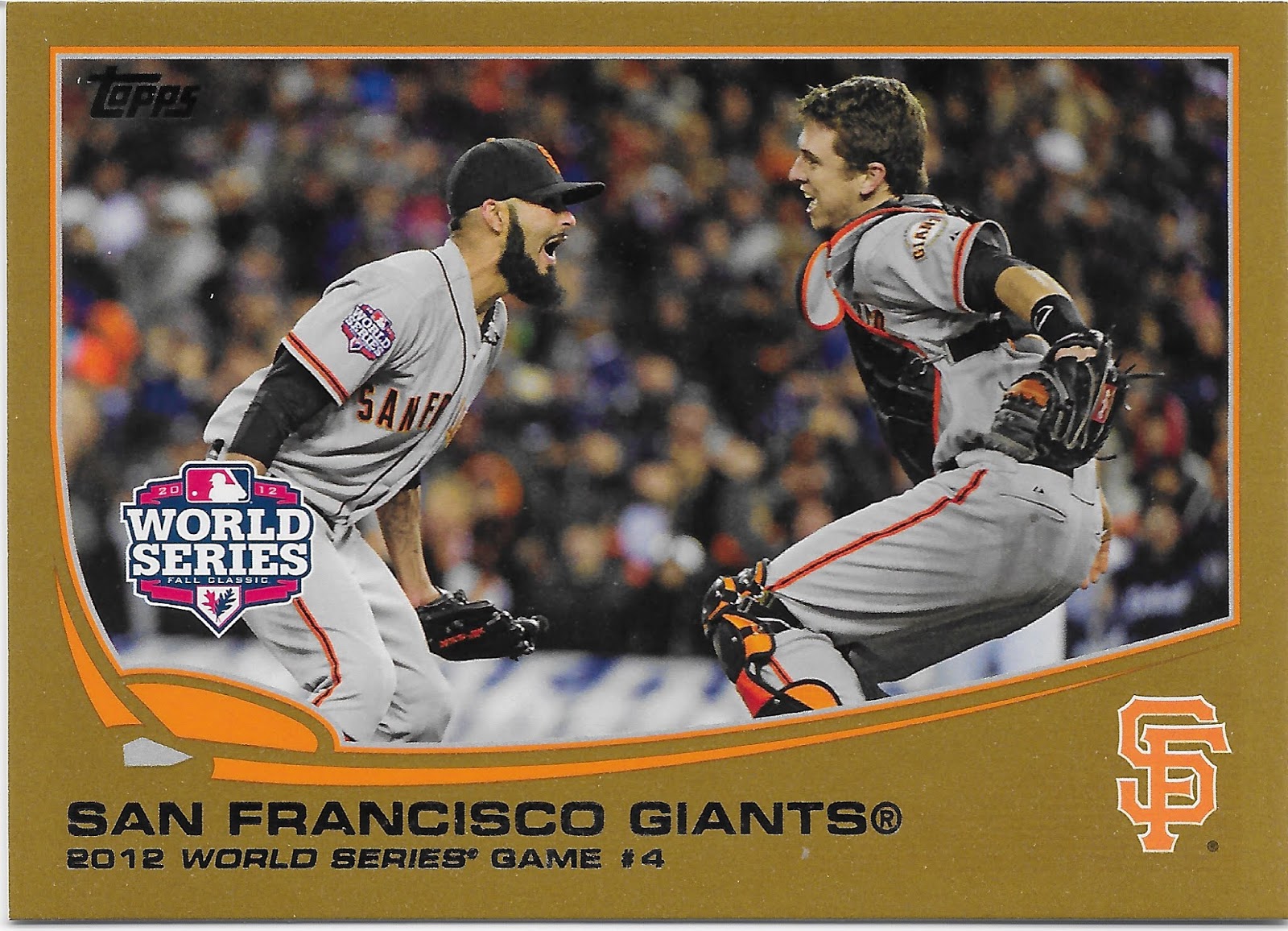
#67 - World Series Game 4


What’s that Turtle doin’? Oh just gettin' all iconic here some 15 seconds or so after the very last second of live baseball action in the 2012 MLB season.

This is pretty much THE image that I now connect to on any stray thought of the 2012 World Series, and as a Tigers fan, I have more stray thoughts on it than most. But to have this image in my mind about that Series pretty much indicates how much time I have spent with this set over the years.

And some of that might actually flow from my experiences with the 2016 World Series, which has some definitely more well-known images of Bryant-to-Rizzo-to-History from the fielding of the final out there. Which is something I never saw on TV and in fact actually heard called by the great Cleveland radio broadcaster Tom Allen. But afterwards, Topps came to my rescue on that with several cards depicting the play, and in their low end sets, too.

So it goes here. I think most collectors would prefer some World Series cards in their Topps Baseball set, even if it is a card depicting basically the lowest point for their favorite franchise in an entire decade.

One thing that is striking about being a Tigers fan is the high levels of bitter vitriol one will encounter in the fan base. In the 2010s, Detroit went on a roll winning 5 straight AL Central titles. But not only did they not "win it all" in the end of any of those 5 years, their one World Series trip resulted in a sweep. And to twist the knife just a touch more, it is worth recalling that the photograph used on this card was shot on the Tigers Home field. It is quite easy to miss that Romo and Posey are wearing their road greys here, amidst all the other baseball goodness. I have long thought that if Detroit could have at least played a 6 or 7 game Series in 2012, Tigers fans wouldn't be quite so cynical and bitter about things, ever afterwards, really. It also doesn't help that by being swept, the Tigers didn't get even one World Series card of their own.

Another angle to the sadness of it all, for a Tigers fan, can be seen in one of the Associated Press photos from the game, which also captures just about this exact same moment:

FILE - In this Oct. 28, 2012 file photo, Detroit Tigers' Miguel Cabrera walks away after striking out to end Game 4 of baseball's World Series against the San Francisco Giants in Detroit. Cabrera will be remembered for two things during the baseball season of 2012: Becoming baseball's first Triple Crown winner in 45 years, and striking out on an 89 mph, belt-high fastball to end the Giants' 4-3, title-clinching win. (AP Photo/Matt Slocum, File)
Yes in a phrase 20th Century Tigers fans can connect to this all too very well, Miggy stood there like the house by the side of the road to officially end the 2012 World Series. It was almost a bit of a blessing that Ernie didn't have to see this one.
Despite all that, I do like this baseball card quite a bit. Even half-sleepy baseball fans who can't even pick a favorite to win a given World Series will stir to action in the bottom of the 9th (or later) inning when the Series is on the line and the big celebration is about to erupt. So this is an excellent moment to immortalize on cardboard. Topps had no shortage of photos to pick for this particular card, from multiple photogs and angles, but this was a good choice.
Minor things I like on this card include seeing all the orange accents on Posey's catcher gear, and the way the World Series logo gets repeated on the card and on Romo's right shoulder. I work with trees for a living, and routinely work in Oak trees, so to get a few Oak leaves mixed in with my love of baseball is always nice, for me.
Uniform Hero? I wish I could tell you that Topps slyly gave some baseball card love to that one bench player who had that key hit in the middle of Game 2 of the Series, but neither S.F. nor Detroit had a player wearing #67 in 2012.

One thing I completely do not understand about this card is why it appears as the first World Series card on the checklist. What does this mean? Will there be other World Series cards? I wish I had a shelf full of perfectly organized Topps Baseball sets to consult on this question - how have other Topps Baseball sets handled this, of which World Series card goes where on the checklist. All I can note here is - I will be looking into that particular bit of baseball card trivia when I read about other World Series in other sets of Topps Baseball.

Where’d the egg hatch? The San Francisco Giants were organized in 1883 as the New York Gothams, only becoming the Giants in 1886.

How about the migrations? One can only imagine what it must have been like to be a huge baseball fan in New York in the 1950s, when not one but two NYC teams moved to California; the Giants became the San Francisco Giants in 1958.

Don’t flip over real Turtles.

I noted on the first post-season card back in this set how there often seems to be only a 50-50 chance that the hero of the card back is the hero on the front of the card. So it is nice that Sergio Romo makes the cut here; Closing games in the World Series is a definite feat of skill. But there will be many more Giants-in-the-Postseason cards to come in the set, so I think the other Giants mentioned will be OK.

But overall, given how it must often be a four letter word spelled w-o-r-k to create baseball card backs, I often wonder why the post-season cards can feel so phoned in, quite often. A line score reveals so very little about a baseball game, compared to a box score, or even just two paragraphs of easy to compose text, rather than this short one. 

Bling That Shell Of all the parallels of the 2013 Topps Baseball set, I think there is only one that is just exactly perfect enough for each card, such that complete binder pages of just that parallel would actually look nice. And that is the classic Topps Gold. So for such a key card in the set, it feels like the right choice:

Tuesday, February 25, 2020

#64 - Will Middlebrooks


What’s that Turtle doin’? It's a bird, it's a plane, it's - an impossible camera angle? I mean, is the photographer allowed out on the field, now?

This is one card where I particularly wish the player's position was noted on the front of the card. I already knew Middlebrooks played Third Base, but knowing that is a big part of what makes this photo even more dramatic. I'm thinking the photographer (Jim Davis, Boston Globe) must have been at least a bit beyond First, to capture Middlebrook's face coming towards us like this. So let's once again see what the Internet might have on this one:


BOSTON - JUNE 26: Red Sox 3B Will Middlebrooks dives, but can't get to a sixth inning ball hit by Toronto's Rajai Davis, not pictured, but the ball went to SS Mike Aviles, who threw to secondbase for a force out to end the inning. The Boston Red Sox hosted the Toronto Blue Jays in a major league baseball game at Fenway Park. (Photo by Jim Davis/The Boston Globe via Getty Images)

Knowing all that mentally drags the image even farther into the middle of the diamond, making this an even more impressive display of camera wizardry. I also like how this photo & baseball card comparison illustrates that sometimes, the crowd is already blurred in the photo, before the Topps wizards go to work.

As for the wizards' decisions here, the card does crop out the baseball zinging past, but that is quite alright in this case.

I have a nice, specific 2013 memory about this card, though not about acquiring the card. I completed Series One fairly early in it's release that winter. A month or so later, with Opening Day quite close, I was delighted to be baseball card shopping in eastern North Carolina one rainy day and the Local Card Shop owner proved to be a Red Sox fan. Naturally, conversation turned to coming season outlooks, and I imparted my base optimism for the Sox' chances that year - "Looks like they have a great new third baseman," I said. "Yeah, did you see that new Middlebrooks card?" replied the owner. "That's one of my favorites. I think the Sox will be back in the playoffs this year." This drew a shrug - the correct pessimistic New Englander response.

I also like how this card foreshadows Middlebrooks famously diving for a ball in the World Series some 7 months later.

There is no question that if I had to pick 9 favorite cards from the 2013 set, this card would make that cut.

Uniform Hero? For such a heroic photograph selection, I would hope the card # would match even though it is not visible. Middlebrooks did wear #64 with the Red Sox in 2012, a number more likely to seen on a Rookie than a veteran.

One other heroic thing about this card is that it finally ends what I have been calling the 'Pitcher Parade' in this set - 16 sequential cards for Pitchers. I have to wonder if that has ever happened on any other Topps Baseball checklist.

Where’d the egg hatch? The Red Sox drafted Middlebrooks in the 5th round of the 2007 draft.

How about the migrations? This is Will's card for his sophomore season in MLB; his Rookie campaign in Boston had this particular baseball card collector already pondering what might happen...

Don’t flip over real Turtles.
That is such a nice looking Rookie stat line. But what those #s, nor the bit-of-a-stretch pun in the card back text, can relate is a certain shadow already routinely falling over the career of Will Middlebrooks: injury; his 2012 campaign actually ended in August.

His 2013 season would include only 93 games and Boston had to work around yet more injuries for Middlebrooks by bringing up another infielder a little earlier than planned, but that ultimately worked out just fine as that younger prospect's name was Xander Bogaerts.

Can the Turtle Catch the Rabbit?

CAREER CHASE: With 54 RBI, Middlebrooks is 2,243 away from Hank Aaron's all-time record of 2,297.

A different stat clipping from his call-up informs this one: in his first 41 games for the Sox, Middlebrooks had 34 RBI. A slugging % > .500 for a Rookie will also bring on such thoughts of a key batting order spot and steady production.

Will Middlebrooks seemed to perpetually battle injury in his career, which probably peaked on this card, really. Subsequent stops included San Diego, Milwaukee, and Texas. A broken leg playing in Spring Training for Philadelphia in 2018 was his final entry on the IL. As the front of this card shows, it seems he always played hard.

Middlebrooks finished his career with 155 RBI.

Subspecies? Recall here that the original photo shows this great attempt at diving for the ball didn't work; perhaps that would disqualify including this great photo in the "Great Catch" series of photo variations in Series One. 

But Topps would hardly let a card this good go to waste, and it is included in both Opening Day and Chrome.

Bling That Shell Like many of my favorite cards in this set, I am a little tempted to collect a rainbow of this card. However it is such a popular card that I can't recall often seeing any of the limited /x parallels of it for sale. The photo is shot at night and the only real feature of the card is Will Middlebrooks himself, so I think any parallel of this would look pretty good; really this is another one for which the base "white" version is hard to improve on as photography clearly trumps design here.

I went with the Opening Day Blue version, probably because I pulled it from a pack but did not hit the OD version of the preceding Masterson card. I believe these parallels are very similar to what are called "foilboards" in the 2020 baseball card collecting world; what is more dramatic here is the nice dark blue frame rather than the background 'foil' effects.

Another great thing about this spot in the checklist is that we have reached the end of a binder page again, and can move on into the checklist and away from the Pitcher Parade via the best way possible in a baseball card binder: by turning the page.


Monday, February 10, 2020

#49 - Chris Sale


What’s that Turtle doin’? Like all horizontal cards, I always get an impression that I am looking at the TV broadcast. Without a doubt, I am influenced in that permanent thought in my brain by the 1955 Bowman design. I should really collect at least a page worth of those cards some day.

On this card it, is even easier than ever to hear the producer out in the mobile truck telling the first base side camera to 'zoom in' just before he cuts back to the traditional shot from center field of the ball crossing the plate a couple seconds after the view on this card.

The illusion of motion is supplied by three things - the crowd blurs in the background, say as the camera follows Sale's arm back as his delivery starts, then the way his necklace does the same as his torso begins moving forward as it begins the drive to the plate off Sale's back foot, and finally you notice the 2 leather end tags of the glove webbing now flying straight up as Sale's right arm begins dropping down in his delivery motion.

And amidst all that, you can still tell that for the whole brief second of time just imagined, Chris Sale's eyes are intensely focused on the point in the strike zone where the ball is about to be delivered, precisely.

I definitely have a love/hate thing going with these zoomed-in torso shot horizontal cards. I quite enjoy horizontal cards, unlike so many uptight baseball card collectors. But I think a horizontal torso is often inferior to a horizontal card that lets you see some game action, and hopefully some of the other sights of Major League Baseball than just a player from the belt up and nothing else. But then on the other hand - when these Pitcher torso cards work, they work, and this one works pretty well, for me, and would possibly make it to a 'Favorite 9' binder page for this set if I were to assemble one. It would definitely make it to such a page of just my favorite horizontal cards.

Another obvious feature of this card is Chris Sale's unique frame, which often makes his cards quick to stand out amidst checklist-mates. It wouldn't surprise me if, somewhere in a visual dictionary of some sort, there is a picture of Chris Sale used to illustrate the word 'lanky.'

The other big 'get' in this image is the special red piping on the White Sox uniform here, and the red hat, and the red belt. This seems kind of odd in that one wouldn't expect the White Sox to want to remind people of the other Sox team in another city altogether. But baseball card collectors probably know better than most that a team with one of the more sartorially simple team names has had one of the longer histories of uniform changes.

These red pinstripe uniforms were a Chicago home uni from 1971-1975. Images of them do exist on 70s cards, however you are probably more able to remember their powder blue road uniform from that era, as Topps was so much more likely to shoot a photo of a baseball player in New York City than any other location.

In 2012, the Sox brought the look back for a special "Home Alternate" uniform they only re-used for that one season, before moving on to mining their many other historical uniforms. This 2012 uni will appear in a few more cards in the set; this one is particularly ironic given Chris Sale's famous disdain for 'throwback' uniforms that surfaced a few years later.

Uniform Hero? Once again, the card # appears nearly dead center on the front of the card.

Where’d the egg hatch? The White Sox drafted Sale in the first round in 2010 as the 13th selection. A pretty canny #1 pick by the Sox, given that the 12 teams in front of them batted only about .333 with their picks.

How about the migrations? There has been just one, a famous / 'blockbuster' trade after the 2016 season, when Sale still had 3 more years of club control, a far more serious affair than trading a 1/3 or 1 season 'rental'. The White Sox received Michael Kopech and Yoan Moncada and 2 more prospects back in return; the story of those 2 players has yet to be fully written although as the 2020s dawn as I write this entry, Kopech and especially Moncada could prove to be key pieces on some likely ChiSox playoff teams in the decade to come. 

As for the BoSox, they won the World Series in 2018 and re-signed Sale for the 2020-2024 seasons. I would say the trade was a great success for both parties, and it is not inconceivable to imagine Sale facing Moncada in a key play-off At Bat in the near future.

Don’t flip over real Turtles.

I like the key detail here explaining Sale's initial career arc, which Tigers fans at the time understood all too well. His experience in the bullpen would certainly serve Boston well in 2018. Though I must confess this is the first I have ever heard of Dave Lemonds, who probably has a baseball (& baseball card) story to tell, but for some other blogger to discover.

Can the Turtle Catch the Rabbit?

CAREER CHASE: With 303 strikeouts, Sale is 5,411 away from Nolan Ryan's all-time record of 5,714.

Being 5,411 Ks away from the All-Time leader certainly seems like an impossible comparison, but for an obviously excellent young Pitcher given this choice checklist spot coming off a season of almost 200 Ks, this comp does make sense.

Sale would go on to start earning some red ink in his card back stats, including an MLB leading 308 Ks in 2017. After the 2019 season and ten seasons of play, Chris Sale has the impressive total of 2,007 strikeouts.

Subspecies? As with most players this low on this unique checklist but high on the MLB totem pole, this card does appear in both Chrome and Opening Day, but without any other variations in any of the 3 pack issued sets, outside of a nicely stamped version in the "AL Stars" 'factory' blister pack of cards assembled by Topps for retail sale, usually in June of each year.

Those retail blister products do supply an interesting Sea Turtle variant, however:

I do not know why Topps chose to create another card for Chris Sale here; this is the only unique card from the White Sox "Team Set." On that particular card, Sale's delivery is captured quite near to the same point as depicted on his regular card, with some of the same motion indicators such as the necklace now being pulled forward. Though Sale always looks interesting on his baseball cards, the odd frame slicing of his hand and then glove re-appearing on the card makes me favor the regular horizontal card much more. This card does give a better view of two left shoulder patches the Sox wore in 2012, but I think we will be able to see those better on an upcoming card.

There are a few other teams that have a unique card for a key star in those Team Sets and those share a key similarity - the pack issued card is a horizontal card, as in this case, and the differing card in the Team Set becomes a vertical card. At first I suspected there may have been a production advantage in not using any horizontal cards for the product, but then I began discovering plenty of horizontal cards still included in the small, generally 17 card sets. My new theory is that for a player selected to be the 'cover' card fronting the stack of cards inside the blister, it looks much better to have a vertical card; and each team has a key player that is the obvious best player that should be the 'cover' player. Other unique Team Set cards are connected to players changing teams during the creation of S1, S2, and Update, and a few Forgotten Sea Turtles were just otherwise forgotten by Topps outside of the Team Sets, something true of one other class of Forgotten Sea Turtle that I won't be posting for a long time to come.

I have been holding off on posting any cards from these  retail blisters, in hopes of finishing off my collection of all 30 teams. And as it turns out, I already skipped over one such 'Forgotten Sea Turtle' card, as I will be labeling them in posts to come. A lot of those cards will actually appear in connection with pack issued cards in Update; on this blog, that will be many years from now. But I have gone back and added one such card, to the #5 - Carlos Gonzalez entry.

Alas, I probably took too long to try and pick up all of the sets and it has now become impossible to find the last few teams I need: Atlanta, Baltimore, Boston, New York Mets, Pittsburgh, and Cleveland. Most of the sets do have a card I want - a "Stadium" card. Those were a remarkable entry on the 2019 Topps Baseball checklist, but were not a completely new idea. The Sea Turtle design serves them well.

I will be adding the Stadium cards to various individual card posts as I move along, generally when a unique "Team Set" card has to be added to an individual card post. There is a 'U.S. Cellular Field' card for the White Sox which could be appended here, but for what should be obvious reasons, I have added it to the #12 - A.J. Pierzynski post.

At this point however, obtaining my own copy of the last 6 team sets I need looks like it will be very difficult. I do want the Stadium cards, and any card in them that is unique to the Team Sets. But even more than that, I need checklist information from them, such as whether a Stadium card even exists (not all 30 of them were made by Topps), and whether any unique card is included on the short checklist (same, in that not all teams have a card different than the pack issued cards). 

If you have any of those 6 'Factory' Team Sets from 2013, please get in touch.

Bling That Shell You should have been able to already guess which parallel I selected here for the All Parallel set:


Similarly to the Rizzo card, this relatively low leverage 'retail' parallel is one of my favorites of all the 2013 cards.

This card is also a perfect place to illustrate a key construction detail on the Sea Turtle cards. For a long time, I didn't understand why I was so drawn to the White Sox parallels in particular. I also often wondered how the 2013 cards would be handled by the 'TPGs' - Third Party Graders. I have zero wish to own any graded cards for my collection, but as I read baseball card hobby commentary on the Internet, I know well how important grading is to others. Overall, I basically feel sorry for people who can't enjoy a card unless it has been declared 'perfect' by someone else.

And of all the possible imperfections that can ruin a chance at perfection, there was one I figured to exist on almost every Sea Turtle card I have ever purchased, _except_ most of the White Sox parallels. That possible imperfection, I thought, was the print registration of the image, and more specifically the boundary between the photo content and the design content.

Here is an example from the same regular white base card scan of the Ryan Cook card in the previous post to this one:


The construction technique is now obvious - rather than have the image snug up to the color portion of the design, whatever color that may be, the graphic design is actually bounded by a thin grey line. However until this is seen in close detail, many a 2013 card looks like the the image and the design edge are just not getting along correctly, leaving a bit of white space rather than a clean connection from imagery to design element.

Here is the same area from the Sale card:
Since the White Sox have a grey team color, there is no additional grey line between image and colorful design element; instead there is a single grey line, thicker than any of the image boundary lines for the other colors in the set.

This gives the White Sox cards, for the most part, an extra crispness to this portion of the card. Although ironically, any teeny tiny flaw in the printing process, leaving a bit of white between the image edge and the design edge, is most easily seen on a White Sox card. Which thus illustrates the reason to use a tiny grey boundary for the image rather than letting the image adjoin the color striping —any white space created during printing would be far more noticeable between colors of the image and the bright color of all non-White Sox designs.

And what I finally realized is that for the White Sox parallels, that increased purity of just the grey striping to the design makes them 'pop' that much more effectively on their parallels. Not so much of that can be seen in a clipping of that same area, from the red parallel:
though there is a touch less white created at the edge of the photography. That would actually vary completely from individual card to individual card, and I don't mean card #49 vs card #48 - ten copies of either card might have ever so slight differences in all this, created during production, not design.

There are many more White Sox cards to come in this project, and many of them are beautiful, crisp parallels. So as with the #12 - A.J. Pierzynski card, I am collecting a full 'rainbow' effort of this card. I would almost like to collect a full White Sox team set in the following parallel (as I started to attempt with one other team, before deciding to collect the whole set in parallel, sort of). So I will leave you with one bonus parallel for this favorite Sea Turtle: